
by John Butcher
A recent study out of Stanford looked at 11 years of district-level National Assessment of Educational Progress (NAEP) data by race and economic disadvantage from all public school districts and concluded that racial segregation is strongly associated with the magnitude of achievement gaps in third grade and the rate at which gaps grow from third to eighth grade. The association of racial segregation with achievement gap growth is completely accounted for by racial differences in school poverty (termed “racial economic segregation”). Thus, racial segregation is harmful because it concentrates minority students in high-poverty schools, which are on average less effective than lower-poverty schools.
On the subject of economic disadvantage, the Virginia Department of Education (VDOE) database offers Virginia SOL data on a granular level, so let’s look at some of those numbers. In particular, the graphs below present 2022 SOL pass rates by subject, per school, for students who are economically disadvantaged (“ED”) (i.e., those who qualify for the free/reduced lunch program, TANF, or Medicaid) and for their more affluent peers (“Not ED”).
Notes: The percentage of ED students below is calculated from the number of ED students taking a particular test and the number of Not ED students taking that test. Data are school averages for the subject area for all grades tested, 3-8 and End of Course. The VDOE suppression rules omit data for just over 3.5% of the entries in the 2022 SOL database, primarily for cases where the number of students in a group is <10.
Aggrieved note: As of 12/20/22 and again on 12/29 (well after I complained), the links on the VDOE Web site to the data dictionary (definition of “economically disadvantaged”) and to the suppression rules, among others, do not work.
To start, below are the school average ED and Not ED data for the reading tests:
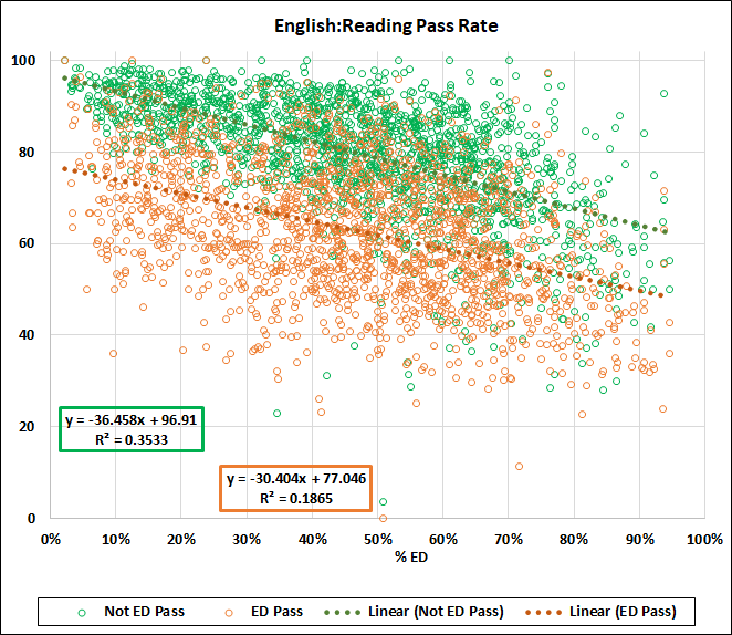
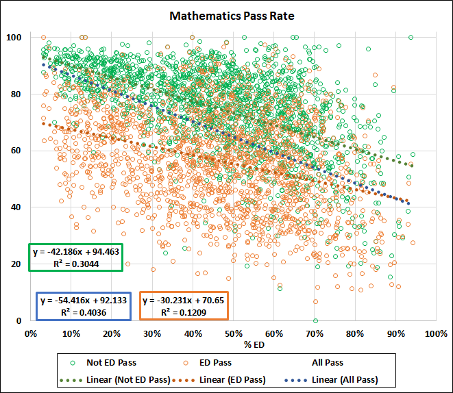
The slopes of both fitted lines are negative, consistent with school performance declining with increasing economic disadvantage. The Not ED rate decreases more steeply so that the Not ED/ED difference shrinks from 19.9 percent at 0 percent ED to 13.8 percent at 100 percent. The R-squared values speak to a modest correlation for the Not ED data and a less robust one for the ED.
Notes: Remember that correlation does not imply causation. These data speak of correlations between the relative number of ED students and pass rates. The R-squared values measure the strength of the correlations. However, the correlations, standing alone, do not prove that the increasing ED percentage causes the decreases in pass rates. And a different matter: In addition to the 3.5 percent suppressed data in the 2022 database, the data from some schools are suppressed for only one of the groups (ED or Not ED), leading to a further 1.9 percent of unusable data for the reading tests, which is 0.15 percent of the database total.
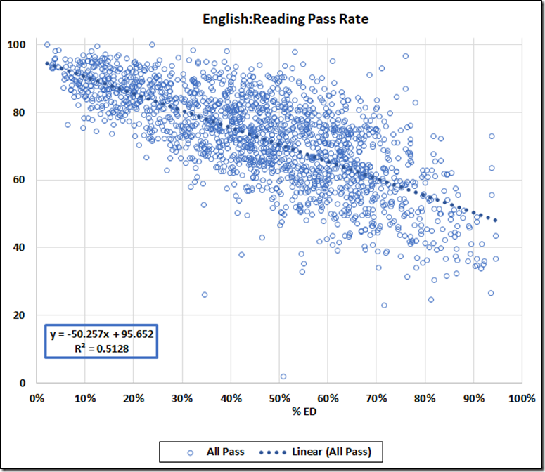
The database also gives the school average pass rate (here the “All” rate). Adding that All rate to the ED/Not ED graph produces an unreadable mess. But we can look at the All data separately:
Or, more usefully, we can add the All fitted line to the ED/Not ED graph
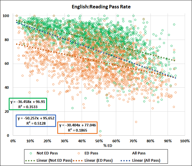
The intercept of the All data fitted line, 95.7, approaches the 96.9 value of the Not ED data. The steeper slope of the All line leads to a 100 percent ED value of 45.4, which is less than the 46.7 value of the ED line at 100 percent ED. And the R-squared value for All data winds up greater than either the ED or the Not ED value.
The explanation is simple: If the All data were the simple average of the ED and Not ED pass rates, the All line would lie exactly between the ED and Not ED lines. The different slope and intercept are reflections of the different sizes of the ED and Not ED groups: At low ED, the All averages are raised by the larger proportion Not ED students, while at high ED, the All values are lowered by the larger numbers of ED results in the average.
Let’s say that again: Because of the roughly 15 point difference between Not ED and ED pass rates, schools with small populations of ED students see their averages boosted by the larger population of Not ED students, while those with large ED populations see their averages dragged down.
Here are numbers for the two extreme cases in the reading data. “Avg. Pass” is the average of the ED and Not ED rates; “Diff.” is the difference between the All Pass (school average) and Avg. Pass.
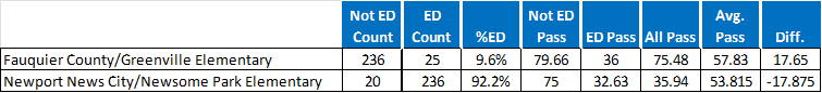
You read that correctly: The school average at Greenville is 17.6 points higher than the average of the ED and Not ED rates; At Newsome Park, the school average is 17.9 points lower.
Yet the Board of Education measures school quality (and accreditation) by the All data, among other factors. Thus, the evaluation process of our Board penalizes schools with larger populations of ED students and rewards those with fewer ED students, even if both groups were taught with equal effectiveness.
The math data tell the same story.
The ED and Not ED data from Virginia imply substantial correlations between ED population and those pass rates. But these data do not tell us the cause(s) of decreasing school performance with increasing ED population. We might expect the following factors to affect that performance:
— Behavior problems with large ED populations;
— Schools with large Not Ed populations can cherry pick their hires; schools with large ED populations often must take what they can get;
— Social pressure from ED students on their Not ED peers;
— Not ED families in high percentage ED neighborhoods may represent the lower end of the Not ED income spectrum; and
— Probably others.
In any case, isn’t it long past time for our Board of Education to abandon its school-average poverty penalty and evaluate schools separately for ED and Not ED pass rates, or by the average of the two?
John Butcher is a retired attorney living in the Richmond area. This column has been reprinted with permission from Cranky’s Blog.