
by James A. Bacon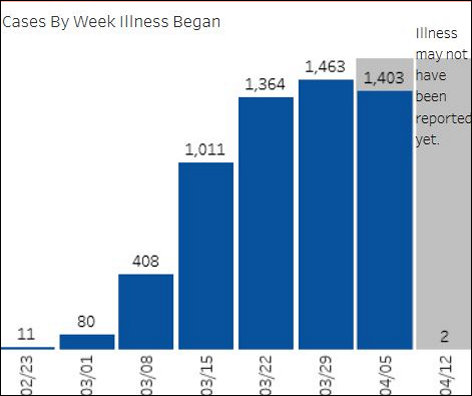
I have to tip my hat to the anonymous state employees who are maintaining the Virginia Department of Health COVID-19 dashboard. They are publishing more data, and they’re spiffing it up with some pretty decent displays.
For example: The graph above, snipped from the VDH dashboard, show the number of confirmed COVID-19 cases by the week the illness began. The graph is useful because gives an indication of how many COVID-19 patients will be moving through the roughly two-week “pipeline” of the disease’s average duration and coming out the other side… either dead or alive.
Combine those numbers with a new Virginia Hospital and Healthcare Association statistic — the number of COVID-19 cases that have confirmed and discharged — and we can get a sense of how many virus survivors there are and we can forecast how many more there will be in the next couple of weeks. VHHA reported that 457 patients have been discharged from hospitals so far.
That’s probably the tip of the iceberg: Many COVID-19 patients show no symptoms, so they never get tested. Still, the trend line is important. Because COVID-19 survivors are presumed to be immune to a second infection at least for a while, the Northam administration should be bending every effort to certify them and exempt them from social-distancing restrictions so they can recycle back into the workforce.
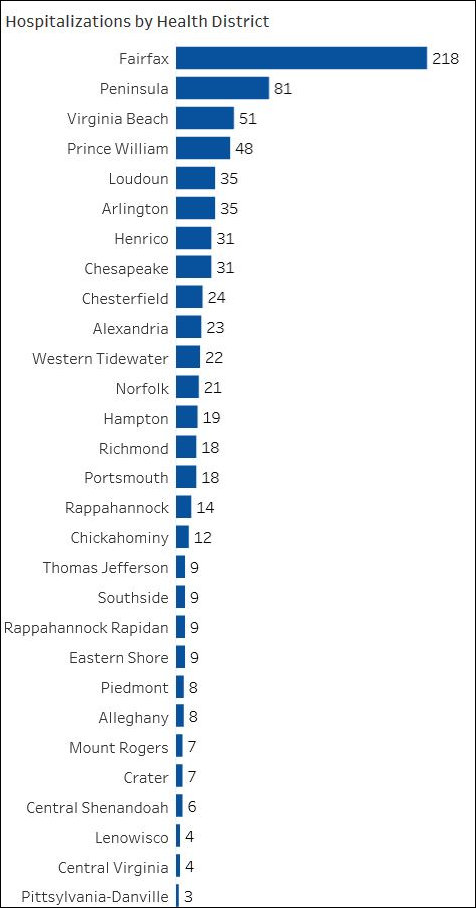 Here’s another useful graph, which displays hospitalizations by health district. It shows clearly that, in raw numbers, Northern Virginia is the hot spot in Virginia, followed by Hampton Roads. That’s not surprising given that the two metropolitan areas have by far the largest populations. The numbers crunchers at VDH could provide a useful service if they could display the number of hospitalizations as a percentage of the population, a far better measure of intensity. (That’s not a criticism, by the way, just a suggestion.)
A word of warning when interpreting this table: It does not reflect people who die from the virus but never make it into the hospital. As of six days ago, 28 people had been reported dead at the Canterbury Rehabilitation and Healthcare Center in Henrico County. Few, if any, were admitted to the hospital. But if you want to know where the COVID-19 virus is wreaking the most havoc, Henrico County may be the real epicenter, which is not reflected in the table.
There are many ways to slice and dice the data, and there is no single-best way to present it. It depends mainly on what want to know. Regardless, public-policy geeks interested in tracking the spread of the virus can be thankful that some unsung employee (or employees) are making an effort to enriching the presentation of the data.