
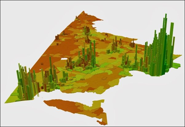
Luke Juday has struck again, publishing a fascinating map on his blog, “Mapping the Commonwealth.” This one depicts the amount of household income in each census district. The greater the population and the higher the income, the higher the spike. Green indicates median incomes that are above average, red below average. (Check his blog for other perspectives on the map.)
The map vividly portrays the overwhelming economic dominance of the Chesapeake Crescent in Virginia’s economy — and Northern Virginia’s dominance within the crescent.
— JAB