
 By Steve Haner
Nothing beats being able to expose the sleight of hand behind one climate alarmism claim by using the data from another climate alarmism claim, with both from the same source: the Richmond Times-Dispatch. It also provides a teaching moment about some of the advocates’ favorite ways to deceive.
Concerned you might not get the message that “climate change” is responsible for making you miserable with allergies, the newspaper offered up two stories on the same topic this month. First, we had this, followed by a second story today. The basic premise that an early spring means that allergies hit earlier is correct; and then the claim is early springs are getting, in a word, earlier. Finally, predictions follow that worse is yet to come.
But two different charts are used t0 illustrate the issue, basically counting the number of days between the last spring and first fall frost. One covers a long time period (more honest) and the second uses an intentionally short time period, resulting in a knowing exaggeration intended to deceive.
Give newspaper staffer Sean Sublette some credit for using the more honest data presentation, reproduced below and using clear source citations. It shows data for all the lower 48 states average growing seasons back to the 1890s, showing an initial decline, then a peak in the 1930s, followed by yet another decline ending in a low point around 1970.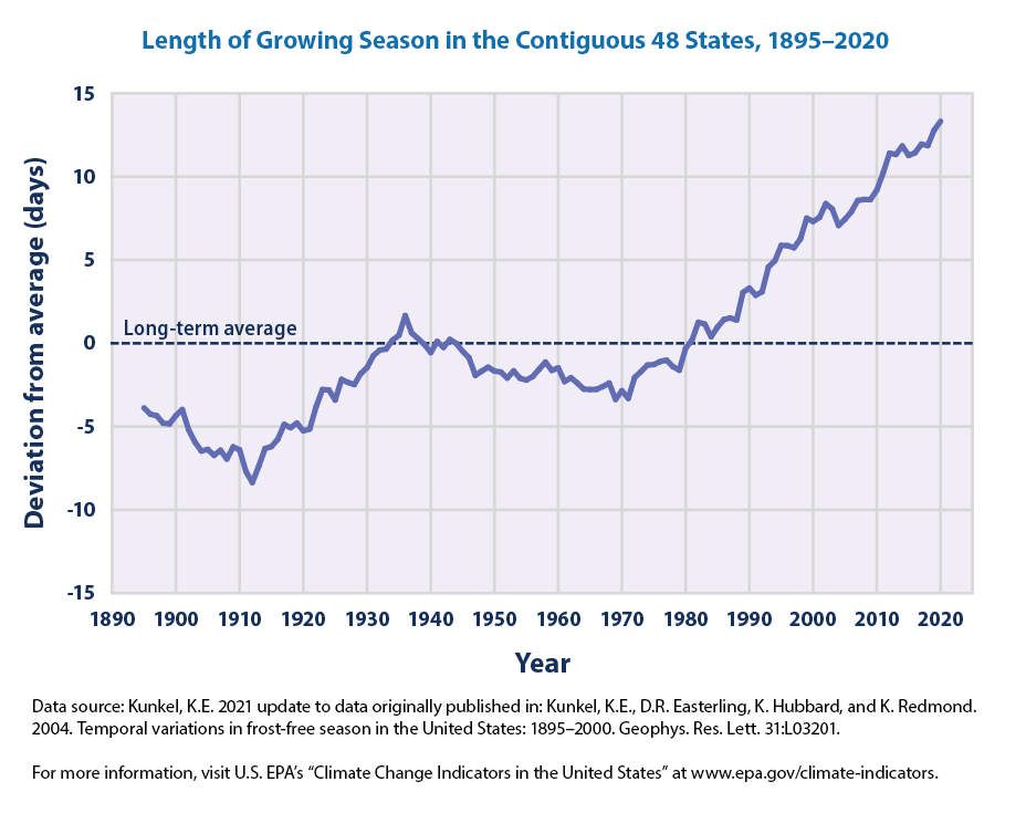
Since the start of the period the number of days between last and first frost has grown perhaps 15, but since the first peak in the 1930s the change has been fewer than 10 days. It stops with 2020. Is that because 2021 and 2022 data wouldn’t fit the narrative?
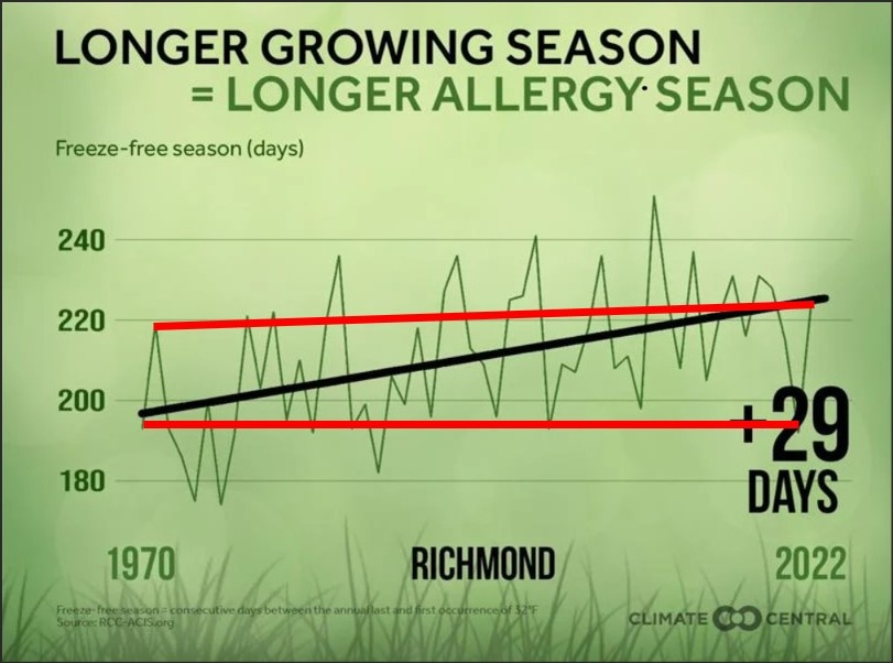
Compare that to the following chart which was captured from the newspaper’s website this morning. It starts with the year 1970, and seems to be for Richmond only. Look at the first line chart, with the longer data set, and the reason this second presentation started with 1970 is obvious. It ignores the 80 years before 1970 which interfere with the impression of unprecedented, straight line change.
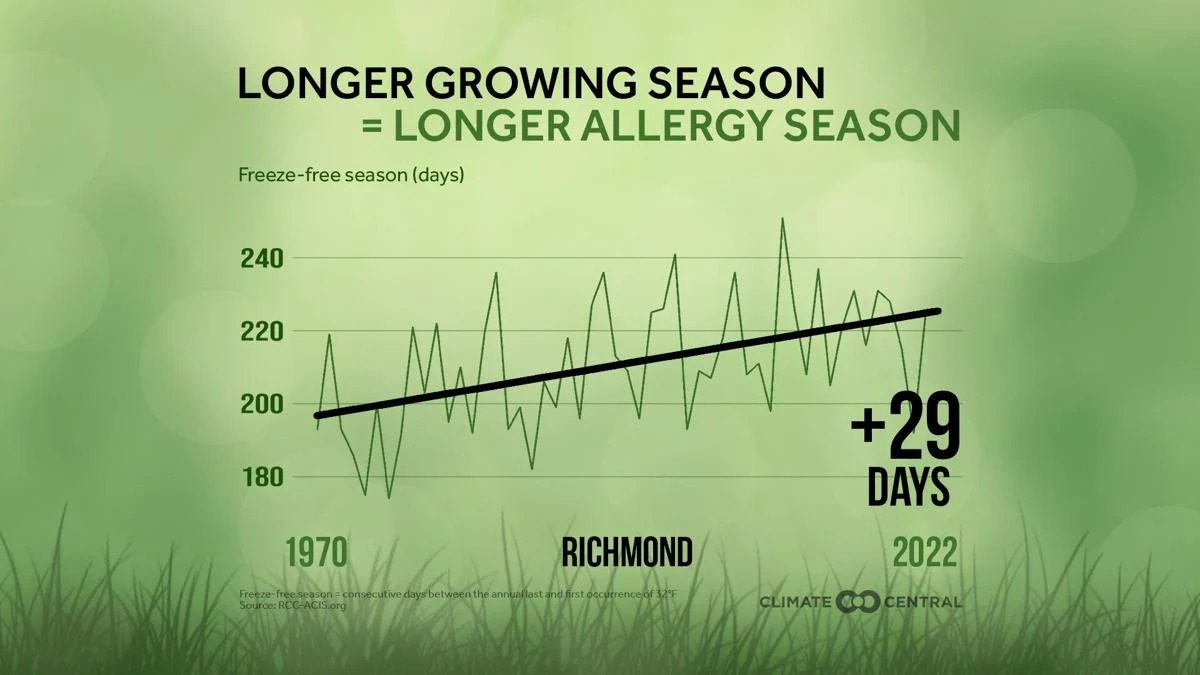 Always remember that charts starting in the 1960s or 1970s are intentionally starting with the recent period of lowest temperatures, the period when the alarmists were instead all over the media screaming about global cooling. Call that end point fallacy or cherry picking.
But wait, as they say; there is more. This second chart does go through 2022 and does show that 2021 and 2022 were lower than previous years. So the first chart may indeed be guilty of ignoring the most recent years with existing data because it didn’t fit the narrative.
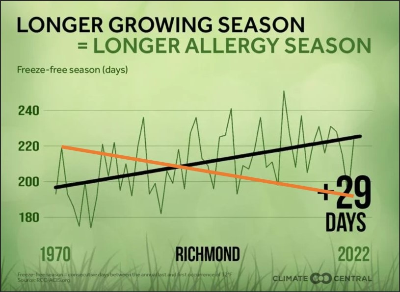
And look at all the high and low points recorded on that second chart. It appears that 2022’s Richmond growing season was shorter than that of at least ten other years going back probably to the 1980s. The range over the period has been from a low below 180 to a high above 240, way above 2022’s. The other table, used in the earlier story, is smoothed data from 48 states but you can bet in individual locations you will see that same pattern of wide variations and peaks long before the present.
The line drawn on the chart to imply a straight line growth of 29 continuous frost-free days between the low year of 1970 and 2022 is totally artificial, again intended to send a false message. It is not an average of the 53 years. Without the actual numbers you cannot calculate a trend line, but the peak has been flat or declining since it first approached 240 days decades ago.
That the northern hemisphere has been in a warming trend since about the 1970s is not in dispute, but in recent years temperature change actually has been flat. Is it about to turn? It could start going up again, or down again, and as the data show, both have happened in the past century.
Another point both stories ignore is that the average temperature rises which have been measured are more about the daily lows, not the daily highs, so fewer frosty mornings fits that data. Urban development is playing at least some role in that, spreading and retaining heat overnight.
But the implication that the period between frosts here has grown 29 days (!) since 1970 and is going to climb another 29 days just as rapidly if we don’t scrap our gasoline cars and gas furnaces and wait for the wind to blow to turn on our lights, that is without any foundation whatsoever.
Leave a Reply
You must be logged in to post a comment.