
I’m playing around with Datawrapper, which provides cool ways to display data– don’t quite have the hang of it, but making progress. Anyway, my inaugural effort shows the considerable variability between school districts in pass rates for English Standards of Learning (SOL) tests.
We all know that the socio-economic status of a student is a major predictor of their academic achievement. Because school districts draw their student bodies from very different socioeconomic backgrounds, it is not fair to compare the academic achievement of Virginia school districts without adjusting for demographics. Therefore, for this map I compare the English SOL pass rate for disadvantaged kids, kids who are poor enough to qualify for free school lunch.
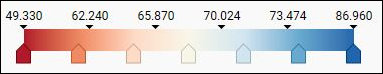
Virginia school districts range from an 87.5% pass rate for disadvantaged kids in West Point, a mill town on the edge of Hampton Roads, to 49.3% for Danville, a mill town in Southside; and from 85.96% in Highland County, the locality with the smallest population in Virginia, to 51.68% in the City of Richmond, the state capital.
If disadvantaged kids in Danville, Petersburg, and the City of Richmond have dismal standardized test results, local educators can’t blame the outcomes on poverty alone. Other localities have poor kids, too, but they have significantly better outcomes. What could explain the variability between school districts?
One possibility is that some districts spend more money per student than others. Perhaps West Point and Highland County spend more per student than Danville and Richmond. The “more money” hypothesis seems less than plausible from a superficial look at the map above, which shows that the pass rates for disadvantaged kids tend to be lower in the affluent Northern Virginia localities. But maybe there’s an explanation that transcends spending per student. Maybe Northern Virginia school districts have more hard-to-educate English-as-a- Second-Language students. The issue warrants closer examination.
Another explanation of the variability seen in the map might be that poverty is worse in some localities than others — not more widespread, but more intense and socially destructive. In cities like Richmond, Petersburg and Danville perhaps the poverty is more concentrated in a few neighborhoods, or poor kids are more concentrated in a few schools, or the degree of social breakdown and dysfunction is greater.
Yet another potential explanation is that school districts have different racial/ethnic mixes and that different ethnic groups put a greater premium on succeeding academically than others. For example, Asians might study harder than their socioeconomic peers in other racial/ethnic groups. Or Hispanics might encourage their kids to drop out of school, become wage earners and contribute to their families.
Yet another option: Maybe some school districts do a better job with the resources and student populations they have.
Finally, a related possibility: Perhaps the move from traditional disciplinary practices to restorative justice disciplinary practices (my pet theory) has eroded discipline and promoted classroom disorder with deleterious consequences for kids who want to learn.
Clearly, the data in this map tells us only so much. But one limited conclusion does seem inescapable. Blaming poor educational results on the prevalence of “poor kids” in the school district goes only so far.
Assuming I can figure out how to create fully functional maps, I’ll be exploring these competing theories in the future.